by Paul Murrell
The New Zealand Herald ran an article by Peter Lyons titled Cost of living getting tougher for Mr Median Kiwi. The article discusses the fact that the overall inflation rate (for the past seven years, 2008 to 2015) hides differences in price increases or decreases for different areas of expenditure. For example, overall inflation was 11 percent, but cost of housing increased 38 percent while communication costs dropped 18 percent.
This report explores CPI data in an attempt to reproduce the results in the original article and to explore the data in different ways (e.g., visually).
Inflation is calculated from the Consumer Price Index (the Reserve Bank has an explanation), so we need CPI data. The article did not include any links to data, but Statistics New Zealand provides a number of CPI data sources:
The data from the CPI visualisation is the easiest to use, so we will work with that. A local copy of the CSV file for these data is provided here.
The first few rows of data are shown below. The 'Level' column shows that we have CPI data for "All groups" at once and for each separate "Group" (Food, Clothing and footwear, etc). The CPI values themselves are in the 'Index.number' column. The file contains data from 2006 Q2 to 2015 Q4.
        Level Series.ref..CPIQ                     Description Quarter Weight Index.number
   All groups             SE9A                  All groups CPI  2006Q2 100.00         1000
        Group            SE901                            Food  2006Q2  17.39         1000
        Group            SE902 Alcoholic beverages and tobacco  2006Q2   7.20         1000
        Group            SE903           Clothing and footwear  2006Q2   4.75         1000
        Group            SE904 Housing and household utilities  2006Q2  20.02         1000
        Group            SE905 Household contents and services  2006Q2   5.49         1000
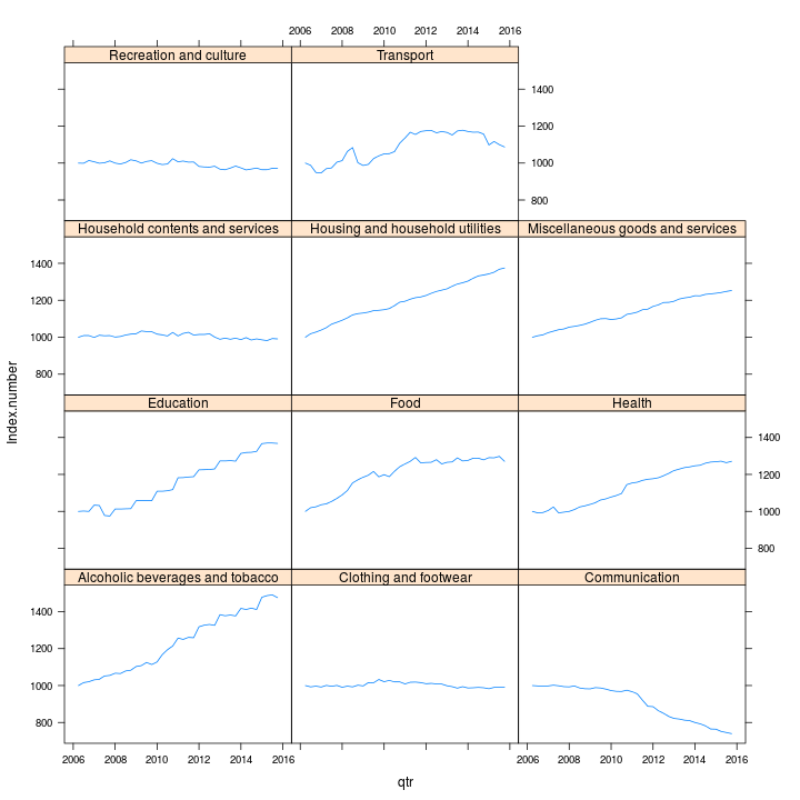
Inflation is just the percent change in CPI from one time period to another, so if we look at CPI over time, an increase represents inflation and a decrease represents deflation. The plot below uses the 'lattice' package in R to plot CPI over time for each separate "Group".

This clearly shows CPI increasing substantially for most groups, but staying remarkably constant for several other groups, and decreasing significantly for "Communication."
This web page was generated from a source document that underwent transformation to an XML format, then an Rhtml format (for use with the R package 'knitr'), then finally this HTML format. The transformation was managed using a Makefile, which also required an XSL file or two for some of the transformations.