Going Beyond Statistical Plots
in R Graphics
Paul Murrell
The University of Auckland
July 2021
Image based on data visualisations from the Poppy Field web site data from Wikipedia.
This image presents data on the number of fatalities suffered during wars in the last century. Each "poppy" has a stem that "grows" from the onset of war and "blooms" at the end of the war. The size of the poppy reflects the number of deaths. The height of the stem represents the duration of the war. At heart, this image is simply a scatterplot, but there are several features of this image that fall outside of the normal definition of "statistical plot." In this talk, we will identify four features of interest and use them to demonstrate some recent R packages, and developments in R graphics itself, that make it easier to produce these non-standard features. An overriding theme is the drive to be able to produce the entire data visualisation in R code. In order to deal with the precise details, the R code that we use will be at the level of the 'grid' graphics package (not 'ggplot2'). The design of this image is entirely based on the data visualisations on the "Poppy Field" site, though this image was created from scratch in R, using data from Wikipedia.
Artistic Curves
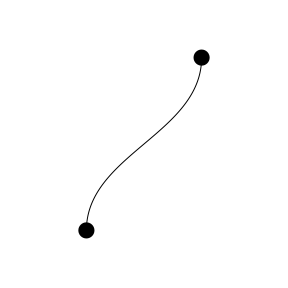
The first feature of interest is the curvy lines that are drawn for the poppy stems. These could be produced in a number of ways, but I want to focus on the fact that these are aesthetically appealing curves. Part of the challenge of drawing these curves is that, ideally, we would only have to specify the start point and the end point of the line.
MetaPost
beginfig(1);
z0 = (30, 20);
z1 = (70, 80);
draw z0{dir 90}..z1{dir 90};
endfig;
end
The MetaPost system is very useful for drawing diagrams because it has a powerful (if ugly) syntax for describing paths. In this example, we describe a curve by defining two end points and the angle at which the curve should leave the first point at enter the second point. The MetaPost system then figures out an aesthetically appealing curve to draw.
The 'metapost' package
library(metapost)
path <- knot(.3, .2) + dir(90) + dir(90) + knot(.7, .8)
grid.metapost(path)

The 'metapost' package provides an R interface to the MetaPost system. This allows us to specify a path in terms of locations within an R drawing. The 'metapost' package then asks the MetaPost system to come up with a nice curve for the path and draws the result back in R.
Complex Shapes
The next feature of interest is the "poppy" flower shapes that are used as data symbols. The reason for using these shapes is because the Poppy is often used to commemorate soldiers who have died in war. These shapes are non-trivial polygons with "holes" between the four "petals".
The 'gridGeometry' Package
library(gridGeometry)
c1 <- circleGrob(.3, .5, r=.2)
c2 <- circleGrob(.5, .7, r=.2)
grid.polyclip(c1, c2, op="xor", gp=gpar(fill="black"))

The 'gridGeometry' package provides an interface (via the 'polyclip' package) to the Clipper library. This allows us to perform "constructive geometry" to create complex shapes by combining simple shapes. In this case, we take two overlapping circles and combine them with an "xor" operator, which produces the union of the circles minus their intersection - a complex shape with a hole in it. Repeating this operation with two more overlapping circles produces the complex poppy shape from four simple circles.
Frills
The next feature of interest is the "shadow" behind the poppies that represent the two World Wars. These provide a visual emphasis on the "Global" wars of the last century.
R 4.1.0
grad <- radialGradient(c("transparent", "black", "transparent"),
                       r1=.15, r2=.25)
grid.rect(gp=gpar(fill=grad))

Some changes in the R graphics engine for R version 4.1.0 introduced the ability to use gradient fills (and pattern fills and clipping paths and masks). Here we define a radial gradient that transitions from transparent to black then back to transparent. The gradient is based on a start circle (in this case with radius 15% of the region being filled) and an end circle (in this case with radius 25% of the region being filled). We then draw a rectangle and fill it with the radial gradient. If we combine four rectangles, each with the gradient fill, then draw the complex poppy shape on top, we get a shadow effect that emphasises the poppy shape.
Layout
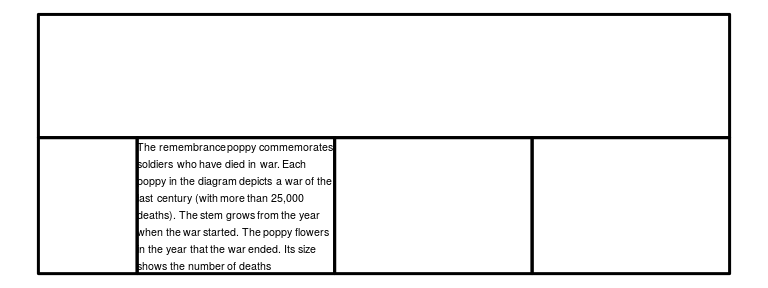
The final feature of interest is the overall layout of the image. The core scatterplot is combined with several other components that provide axes, legends, and explanatory text. I want to focus in particular on the paragraph of text. Although R has facilities for generating arrangements of rectangular regions, a difficulty with this arrangement is that it depends on how many lines of text there ends up being in the paragraph of text. In this image, that dictates the height of the bottom row of regions.
HTML and CSS
html <- glue::glue('<div id="main"></div>
                    <div id="diagram"></div>
                    <div id="caption">{caption}</div>
                    <div id="size"></div>
                    <div id="region"></div>')
css <- 'body {
          font-size: 8pt;
          display: grid;
          grid-template-columns: 1fr 2fr 2fr 2fr;
          grid-template-rows: 1fr auto;
        }
        #main {
          grid-column: 1 / 5;
        }'
A web page has to solve this sort of problem all the time. The combination of HTML and CSS above defines five regions arranged in two rows and four columns. The "main" div occupies the entire top row. The bottom row is divided up with the first column only half as wide as the other three columns. The height of the bottom row is determined by the content of the regions, which comes down to the typesetting of the text in the "caption" region.
The 'layoutEngineDOM' Package
library(layoutEngineDOM)
grid.html(html, css=css, viewports=TRUE)

The 'layoutEngineDOM' package sends HTML and CSS to a web browser and asks it to return the result of laying out the HTML content. The result is then drawn back in R, including creating 'grid' viewports for each region.
The 'layoutEngineDOM' Package
mainvp <- grid.grep("main", grobs=FALSE, viewports=TRUE)
downViewport(mainvp)
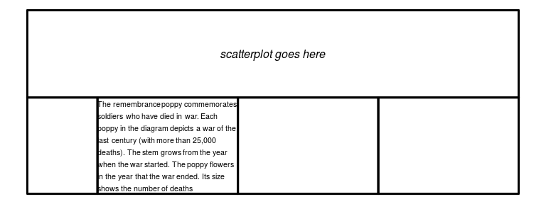
grid.text("scatterplot goes here", gp=gpar(fontface="italic"))

We can navigate to the viewports that have been created to draw each of the different components of the image.
Summary
Some recent work has expanded the range of possible data visualisations that can be produced entirely in R code:
-
Expanding the vocabulary of R Graphics.
- R 4.1.0
- The 'gridGeometry' package (CRAN)
-
Integrating R Graphics with other graphics systems.
- The 'metapost' package (CRAN)
- The 'layoutEngineDOM' package (GitHub)
Acknowledgements
- MetaPost
- The 'polyclip' package and the Clipper library
- Firefox, Chrome, et al (HTML/CSS layout engines)
Resources
- The complete R code for the "Poppy Field" image.
- "MetaPost Three Ways"
- "A Geometry Engine Interface for 'grid'"
- "Catching up with R Graphics"
- "Rendering HTML Content in R Graphics"