Add to Plot
The Add to Plot window lets your customise your graph, explore patterns in the data, and highlight important features. The options available to you depend on the type of variables you have selected and the plot drawn.
At the top of the Add to Plot window is a drop down that lets you select from one of the available panels:
- Customise Plot Appearance
- Trend Lines and Curves (scatter/hexbin/grid-density plots only)
- Axes and Labels
- Identify Points
Customise Plot Appearance
This panel allows you to control most of the visual aspects of the graph, including size and colour.
General Appearance
This section is common across all graphs, with the exception of the options listed in the "Plot type" dropdown.
-
Plot type: allows overriding the default plot chosen by iNZight, which is based on dataset size.
Types of plots in iNZight
One numeric variable (and optionally one categorical variable)
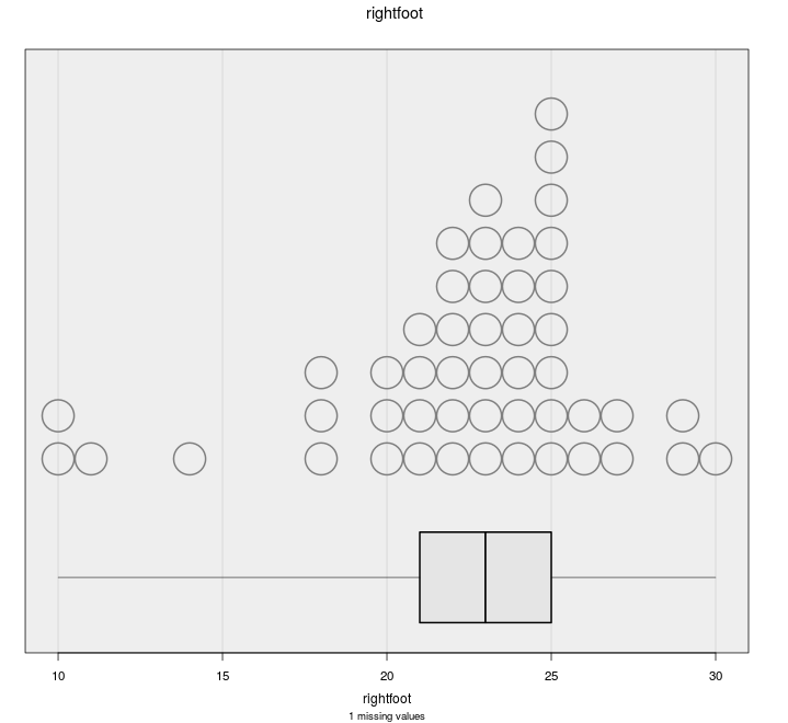
Dot plot
default for small samples
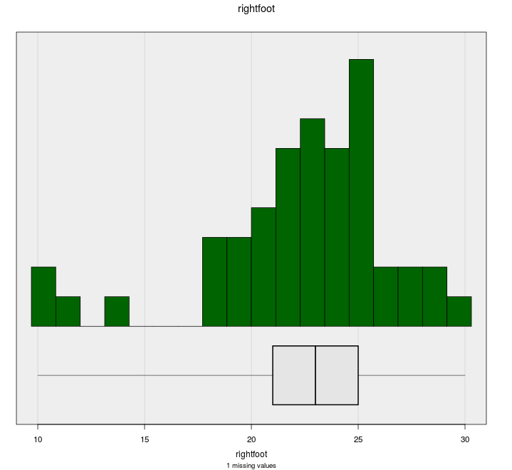
Histogram
default for large samples
Two numeric variables
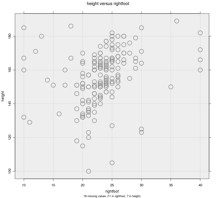
Scatter plot
default for small samples
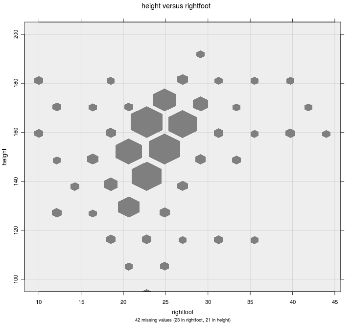
Hexbin Plot
default for large samples
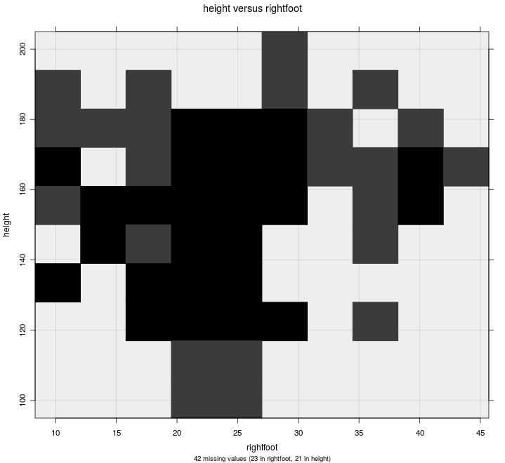
Grid-density Plot ("2D histogram")
useful as a teaching example
One or two categorical variables
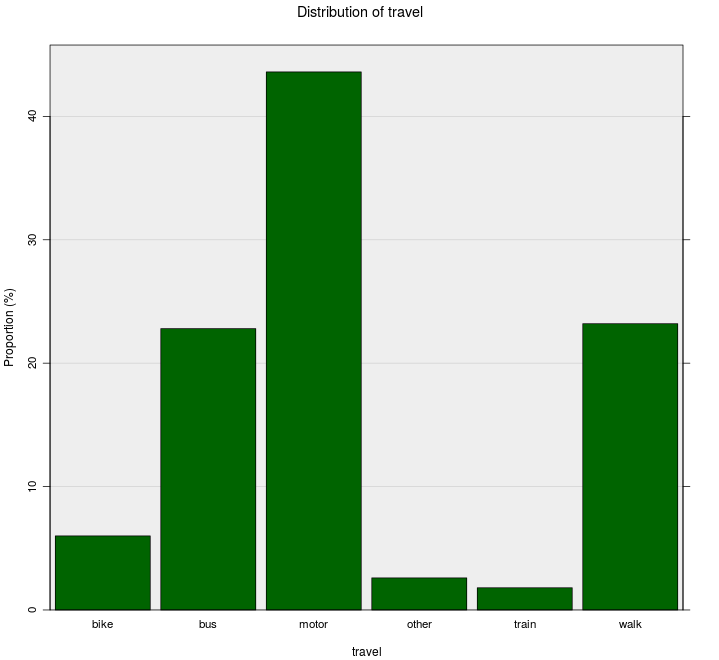
One-way bar chart
Two-way bar chart
-
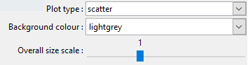
Background colour: you can customise the background colour of your graphs to suit your preference, or make certain features easier to distinguish.
You can specify colours using names or HEX codes.
-
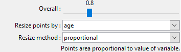
Overall size scale: this lets you adjust the overall size of everything drawn on the screen.
This works as a baseline, so all other size settings will be multiplied by this value.
Size / Point Size
Control point sizes on scatter plots and dot plots, hexagons on hexbin plots, and bar-widths on histograms.
Size by variable: On scatter plots, you can choose a numeric variable to be used to resize the points.
Colour / Point Colour
Change the colour of points, hexagons, and bars. Colours can be chosen from the list, or you can type your own. See choosing colours for more information.
Colour by variable:
(scatter plots / dot plots / hexbin plots / one-way barplots).
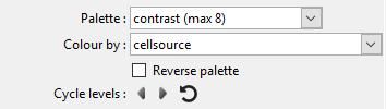
Select a variable to code colours.
Several choices for colour palettes will be offered.
-
Categorical variable: Each category will be assigned a colour (depending on your chosen palette)
Scatter plots and dot plots: Points are coloured according to the level of the variable.
Hexbin plots: hexagons are coloured depending on the proportion of points in each category that fall within that hexagon.
One-way bar plots: the bars are segmented depending on the proportions of each category and coloured accordingly.
-
Numeric variable: a linear scale is set up from the lowest to the highest value, and each point is coloured based on its value.
If you click the Use rank checkbox, the colours will be based on quantiles, rather than absolute values. This can be helpful if you have a few very large values of the chosen variable.
NOTE: if you choose a numeric variable on a hexbin plot, iNZight will convert it to a 4-level categorical variable.
 Colour by a categorical variable
Dot / Scatter / Hex / One-way Bar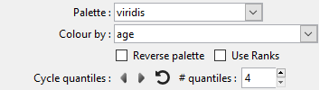 Colour by a numeric variable
Dot / Scatter
Cycle levels: You can cycle through the various levels (or quantiles for numeric variables), making it stand out from the others, by clicking the left and right arrows. You can adjust the number of quantiles to use by adjusting the number in the box.
Point Symbols
Select different symbols to use on scatter plots and dot plots.
Symbol by variable: You can also chose a categorical variable with 5 or fewer levels, and iNZight will give each its own symbol. This is particularly useful when creating colour-blind friendly plots, or for black-and-white printed graphs.
Diamonds and triangles can take a long time to draw if you have a big data set (at least on Windows). Circles (the default) and squares seem to be OK.
iNZight will turn off transparency if you change plotting symbol to one of these; you can put transparency back, but iNZight may become unresponsive while it tries to draw the graph.
Trend Lines and Curves
On scatter plots, hexbin plots, and grid density plots, you can add various types of lines to the graph.
Trend Curves
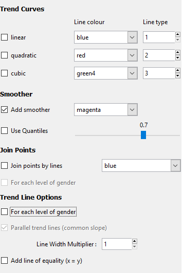
Trend curves are fitted using linear regression models, which minimises the overall vertical distance between points and the line.
The formula for the line (which can be found by clicking the Get Summary button after adding a trend line) depends on the type of curve fitted.
In these equations, y is "Variable 1", the primary variable of interest,
and x is "Variable 2".
The greek letter \(\beta\) ("beta") represents an unknown value,
and iNZight picks the best value to make the line fit the data as
well as possible.
The subscripts (\(\beta_0, \beta_1, \ldots\)) simply indicate different unknown values.
-
Linear: a straight line fitted through the points: $$ y = \beta_0 + \beta_1 x $$ It has an intercept, \( \beta_0 \), which represents the value of \(y\) when \(x=0\), and a slope, \(\beta_1\), which describes the change in \(y\) for a unit change in \(x\).
-
Quadratic: a curved line with at most one bend: $$ y = \beta_0 + \beta_1 x + \beta_2 x^2 $$
- Cubic: a curved line with up to two bends: $$ y = \beta_0 + \beta_1 x + \beta_2 x^2 + \beta_3 x^3 $$
For more details, see this page of the Data to Insight course.
Smoothers
These curves are fitted without the restrictions of the regression models shown above. iNZight uses a loess smoother, and you can control the degree of "smoothness" using the slider.
If you have a large data set, you can add quantile smoothers, which draw lines at not only the middle (median) of the data, but also at the quartiles, 25% and 75%, and the 10% and 90% quantiles if the sample size is large enough.
Join Points
In some cases, you may have ordered data that makes sense to connect points, for example a time series. If you specified a categorical colour by variable, you can optionally connect points within each level of that variable.
Trend Line Options
If you specified a categorical colour by variable, you can fit a trend curve through each level of that variable. By default, the lines will have the same slope, but different intercepts, so they will be parallel. If you want the lines to be completely independent, you can uncheck the parallel trend lines box and each level will also be given its own intercept.
Line Width Multiplier will adjust the thickness of lines.
The line of equality is useful when the units of the two variables are the same (for example, "before" and "after" measurements).
Axes and Labels
Axis Labels
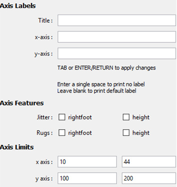
Type your own labels to override those automatically created by iNZight.
To remove labels, just enter one or more spaces into the box and press enter.
Axis Features
For scatter plots only.
-
Jitter: This adds a small amount of noise to each value, which helps to separate out discrete variables (for example, age).
- Rugs: This adds a small line on the axis for each point, making it easier to read values for extreme points.
Axis Limits
This allows you to adjust the limits of the axes, effectively allowing you to "zoom in" on specific regions.
Number of bars
On bar charts, you can adjust the total number of bars shown at a time. This is useful if a categorical factor has too many levels to display all at ones.
Identify Points
This allows users to label points in one of three ways (text labels, colour labels, and related points), using one of three methods (clicking, selecting values, or labelling extreme points).
How do you want to label points?
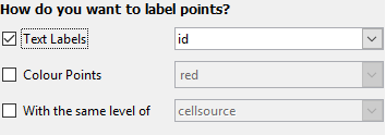
- Text labels allows you to select a variable from the data set with which to label selected points
- Colour points allows selected points to be filled in with a selected color. (See ways of choosing colours.)
-
With the same level of allows you to easily locate points related to the selected points.
The main use of this would be to locate points with the same level of a chosen factor (e.g., if you are exploring survey data, you may wish to identify observations in the same cluster), or you may want to retain points selected over multiple graphs (e.g., in the Gap Minder data set, included in the
Datafolder, has several observations of countries over multiple years. In this case you can label certain coutries and track them over time).Note: when you do this, the point you clicked will be highlighted for easier reference.
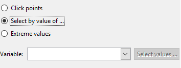
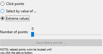
How do you want to select points?
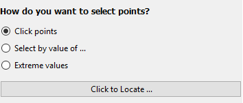
-
Clicking with the mouse: After clicking "Click to Locate ...", you can then click a point on the plot. iNZight will then label it using the options you defined above. You can select multiple points by clicking the button again and locating new points without losing the current selection.
Note: due to the way the software works, you may see a "Busy" cursor after you click the "Click to Locate ..." button. This will not go away until you click a point, so go ahead and click points ignoring the cursor.
-
Select by value of ...: this will allow you to select a variable to use to select points.
If the variable is a factor (or a numeric with less than 20 unique values) a slider will appear allowing you so quickly select the levels you wish to label. If the variable is numeric, or you want to select multiple levels, you can click the "Select levels ..." button to do so.
-
Extreme values: This will use a very simple algorithm that will select the points "farthest away" from the bulk of the data.
This will display a slider, allowing you to select more or less points as desired. Once you have selected the points, you can optionally save the selection (e.g., if you want to track the same observations over multiple plots) you can click the "Save these points ..." button. From there you can use the "With the same level of" option to select related points, etc.
The statistic used is Mahalanobis' distance.