About Presenting Data on Maps
This article gives an overview of plotting data on maps. It is not software documentation. (The software documentation is here)
Plotting data on maps is a specialised area that is quite different from normal graphing. This article describes the sorts of data we can present using maps and ways in which we can use maps in constructing data visualisations to help ourselves and others better understand that data.
We start by outlining the types of data that are appropriate for presentation on maps and then go on to show ways of visualizing data using maps; addressing important issues about using maps for data visualization as they arise.
Everything you see illustrated in this article is very fast and easy to obtain using iNZight's Maps module.
The types of data most commonly plotted on maps
The two types of data most commonly plotted on maps are location (or geographical coordinate) data and regional data.
- Location (or Graphical Coordinate) data:
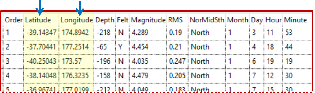
This is data on things that have happened at particular geographical locations. The most widely understood way of specifying a location is by its Latitude and Longitude, though there other location coordinate-systems. Additional variables give information about what happened there,
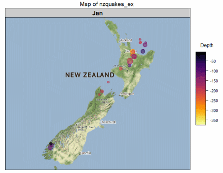
- Example: the data below on earthquakes in New Zealand in the year 2000 where we have information about where the epicentre of the quake was (latitude and longitude), how deep underground it was, how strong it was, when it occurred, and several other variables.
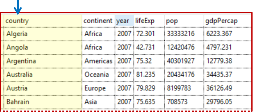
- Regional data: This is (region-level) data on different geographical regions. By regions we mean things like countries of the world; or states/counties/electoral districts within a country. The associated variables usually give summary measures for each region,
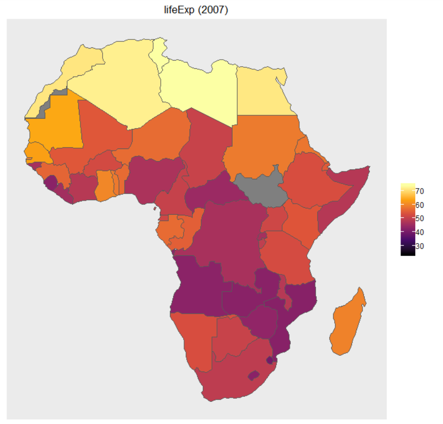
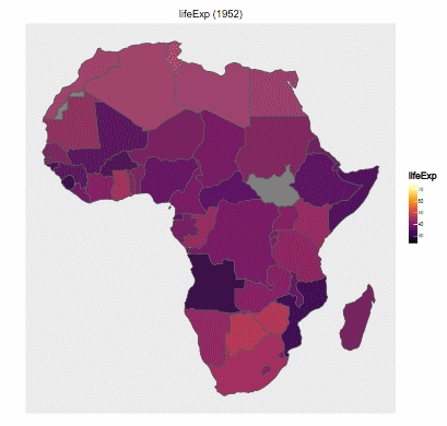
- Example: the table extract below shows data on different countries of the world which includes: the year the data relates to, average life expectancy, population size, and GDP per capita.
Statistical exploration of data using maps is typically concerned with finding patterns in the data that are related to geography, leveraging off what we can see about what is close to what (or far from what), and the reminders the maps give us of our own general knowledge about different locations. We are particularly looking for patterns that make some sort of sense (or are interesting) geographically, and any notable exceptions to those patterns.
Plotting Location data
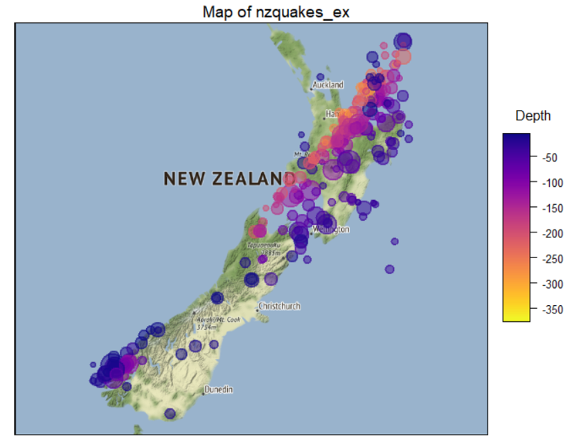
With location data we start by plotting the locations (latitudes and longitudes) on the map using some form of plotting symbol (e.g. a circle). But doing that that just shows us the locations we have data for. It does not communicate any of the information we have about what happened at each of those locations. So we need ways of putting the additional information from some of these other variables onto the map as well.
Adding more information than just locations
(for static, dynamic and interactive maps)
Relate the values of different variables to some of the following:
- Size: the size of the plotting symbol
- Colour: the colour of the plotting symbol
- Shape: the shape of the plotting symbol
- Opacity: the opacity vs. transparency of the plotting symbol
- Labels: Put labels by the points (names, numbers)
Also,
- Connect points by lines: if the data is in time order this conveys information on the order in which
things happened (and, e.g., trace the migration path of a whale)
- Have the points appear sequentially in time order: another way of conveying the sequence of events (not implemented in iNZight yet)
(for interactive maps) (- jump to interactive maps)
- Hover over: Display the values of variables when the mouse hovers over a point
- Select/Brush: When points on the map are selected in some way, initiate some sort of new display.
This make be as simple as showing labels and variable values, or we could throw up some new graph,
or highlight related features in another graph
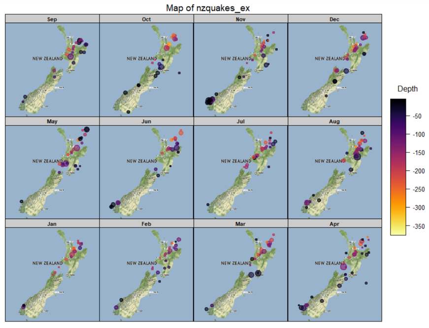
Subsetting/Faceting
- Array of maps: let’s you see a lot of maps at once and compare them
- Playing through a sequence of maps: Can be good for looking at changes (e.g. over time)
Interactive Map plots
Example
Here is an interactive version of the February plot. This one responds to hovering over points, and selecting a set of points by left-clicking and dragging. Which variables get displayed when hovering is controlled by the "Variables to display" dialog a the top of the frame. When a set of points is selected by dragging, their data values appear in the Table. Clicking on "Table" at the top of the frame toggles between removing the Table and bringing it back again. (Click the graphic's help page -- small "?" at top right.)
Contour plotting
(cf. the contours of equal atmospheric pressure ("isobars") on a weather map, or of equal altitude on a topographical map -- Still to be written- not implemented in iNZight yet)
Plotting Regional data
Typically people colour regions of a map according to the value of a (single) variable. Such maps have historically been called choropleth maps. If the colouring has been done according to the values of a continuous variable the result is sometimes called a heat map. (Different shading patterns are sometimes used as an alternative to using different colours.)
Issues:
- Matching data points with regions on a map: Mapping software typically draws regional maps using so-called shapefiles which contain the boundary of each region (as the vertices of a polygon) and the names of the regions. To produce a choropleth map, the shape file is used to draw the outlines of each region. Then a variable in the data set containing the names of the regions has to be matched with a corresponding naming-variable in the shape file so the program knows what observations in the data file correspond to what regions on the map.
- Several sets of name variables are often included in a shape file (e.g. the set off full names and a parallel set of common abbreviations) to make it more likely that there will be a set of names that matches with the region-name variable in a data set. Otherwise the names in the data set will have to be changed to conform with one of the naming conventions available in the shape file.
- Labels: Viewers will seldom reliably know which regions are which just by looking at the map so name-labels are often added (e.g. the names of each state or their abbreviated form). The numeric value of the plotted variable might also be added for each region.
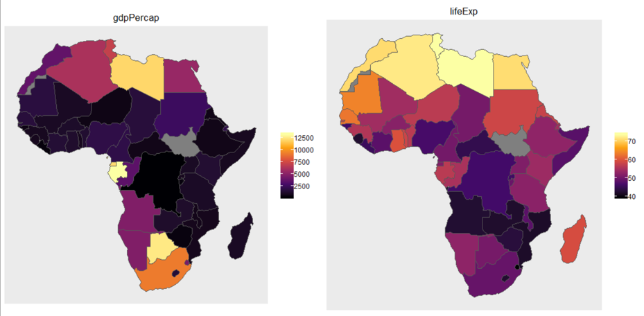
- Scales: Each map only displays the values of a single variable (in addition to region), but we can look at the behaviour of several variables at the same time if we put several maps on the same page, one for each variable.
-
Then the issue of what to do about scales becomes important. Are the scales the variables are measured on comparable?
- Non-comparable scales case: When the scales are not comparable (as with GDP per capita and Life Expectancy in the plots above) we translate values to colours in graphs independently of one another
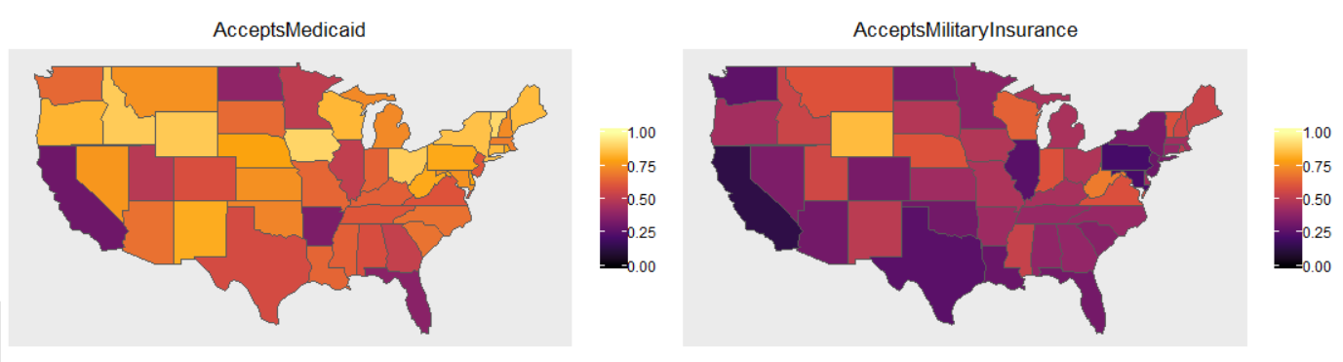
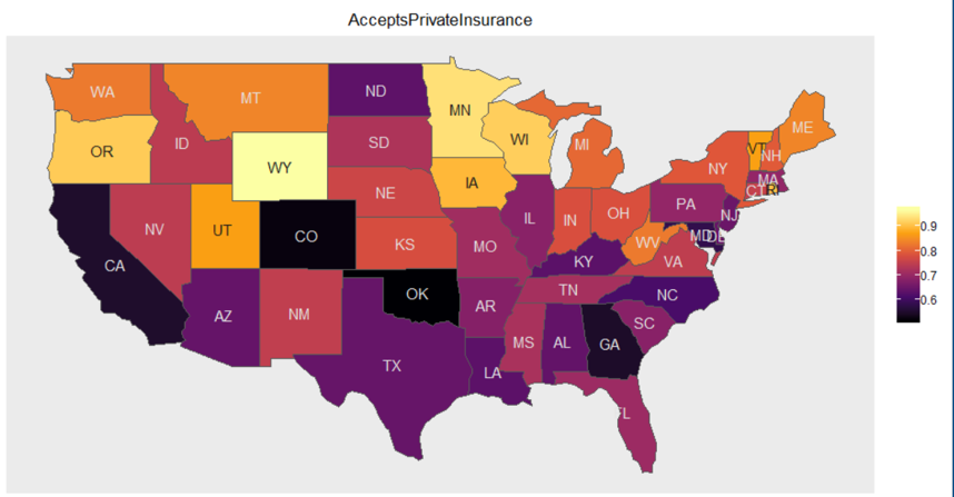
- Comparable scales: But when the different variables are measured on the same scale (as in the plots above where both variables are proportions), we generally want to translate variable-values to colour values in the same way for all of the graphs so that we can compare values across graphs
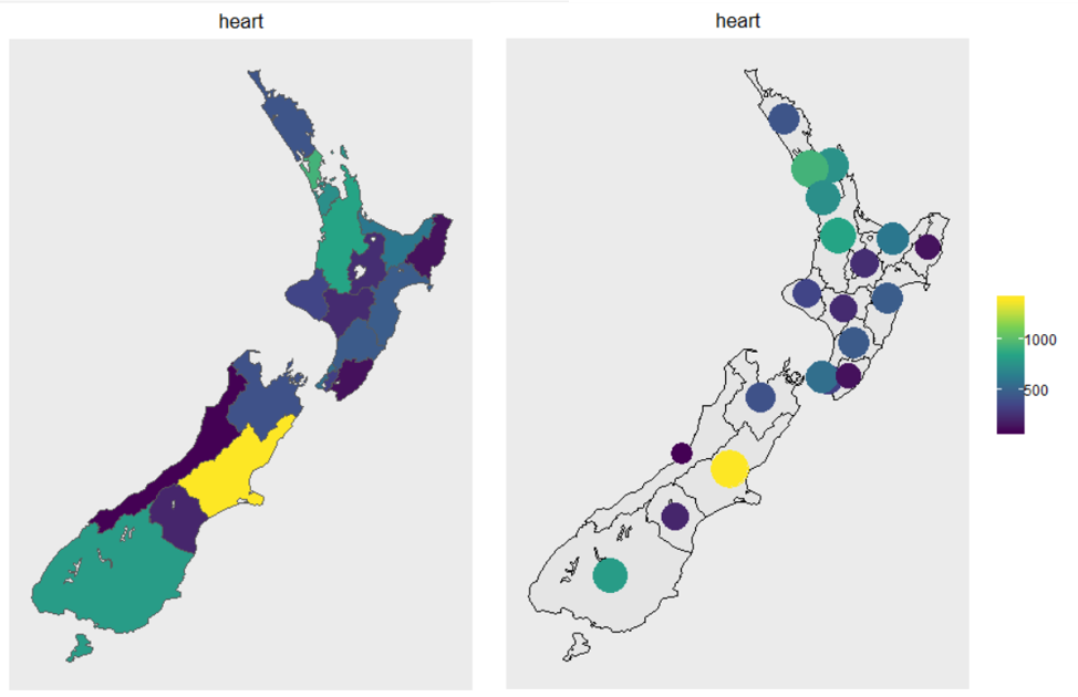
- Distortions due to land area: Colouring regions misleadingly makes large unpopulated areas look more important than smaller highly populated areas (e.g. US political maps produced in this way misleadingly make the much-less-populated centre regions of the country look much more important contributors to election results than the heavily populated coastal regions)
- Alternatives that try to get around this problem:
- Colour superimposed symbols rather that the regions themselves: Use colour shapes (e.g. disks) centred at the centre of each region and size the shapes proportional to population (as in the "heart" example below). We call these disks centroids.
- Cartograms: distort the shapes in the map so the region sizes are approximately proportional to population sizes (not implemented in iNZight yet)
- Dots: pepper regions with coloured dots, with each dot representing the same number of people (not implemented in iNZight yet)
- Alternatives that try to get around this problem:
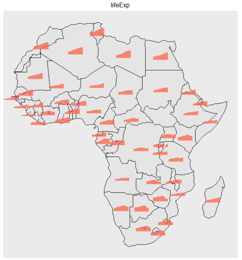
- Conveying several variables on a single map
- There are a variety of multivariate glyphs that can be used as superimposed objects (instead of colouring regions)
- Changes over time (or values of some other variable):
- Playing through a sequence of maps: Can be good for looking at changes over time
- Superimpose glyphs that are a mini time-series
- Interactive graphs link to more detailed time series in various ways
Interactive Plots
Preview of Example (still image)
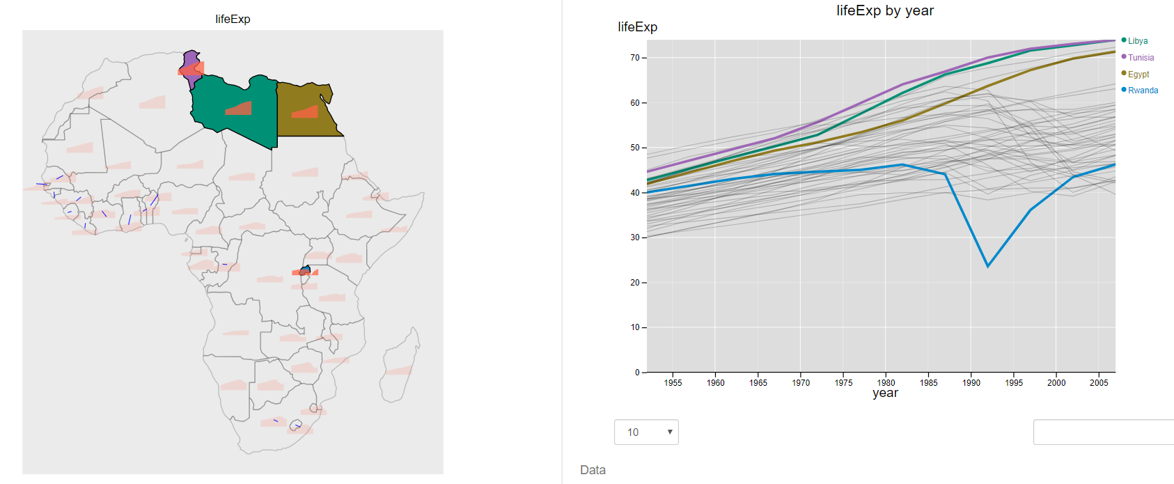
Example of an interactive plot for showing changes over time with time series
There is a great deal of interactivity besides hover-over in this plot. Clicking on a Country (but not on the little icon within the country) highlights the detailed time-series plot for that country on the right. Holding down the shift key while you click enables you to add countries. You can likewise hover over the set of time series on the right-hand plot to discover details, or click (or shift-click to accumulate countries) to link back to the map on the left. You can also pan (click and drag) and zoom (mouse wheel) on the map plot to get closer to small areas. (Click the graphic's help page -- small "?" at top right.)
Example of an interactive plot for showing changes over time using a "movie"
Click "Table" to remove the table. You can change the year using the slider at the upper-right, or play across years by clicking play button just under it. The variable being represented on the map can be changed using "Variable to display". Panning and zooming works here too. (Click the graphic's help page -- small "?" at top right.)
Some more issues
(yet to discuss)
- Map projections
- Colour palettes – what’s good for what
- Compensating for deficiencies in colour perception – augmenting maps with complementary plots/tables